
Colour through the ages: what Georgian interiors still teach us today
The colours we choose for our homes are never arbitrary. They carry history, intention, and a quiet understanding of how we want to feel inside our own walls.
Stand inside a well-preserved Georgian drawing room and something interesting happens. Despite being surrounded by hues that were mixed from lead, chalk, and ground mineral pigment — colours that have no business feeling contemporary — the room settles. It does not overwhelm. The walls recede, the furniture comes forward, and the quality of the light feels considered. This is not an accident. It is the result of people who understood, with extraordinary precision, how colour behaves in a room.
We are, today, at a curious moment in residential colour. After years of safe greige and cautious off-white, there is renewed appetite for colour that means something — for interiors that feel rooted, layered, and alive. The lessons of the Georgian period, it turns out, have never been more relevant.
The Georgian palette: colour as cultural statement
Georgian interior colour — from roughly 1714 through to 1830 — was shaped by two forces that do not often sit together: strict social convention and genuine aesthetic boldness. The colours were informed by trade, technology, and taste in equal measure. Wedgwood blue, sage, pale yellow, and stone were not chosen because they were safe. They were chosen because they were new.
The mineral-derived pigments available to Georgian painters and plasterers produced colours of a particular quality: slightly chalky, optically complex, never flat. Wedgwood blue — that cool, refined hue synonymous with the period — read differently at noon than it did by candlelight, and this responsiveness to changing light was understood as a virtue, not a liability.
THE GEORGIAN INTERIOR · A RECONSTRUCTED PALETTE
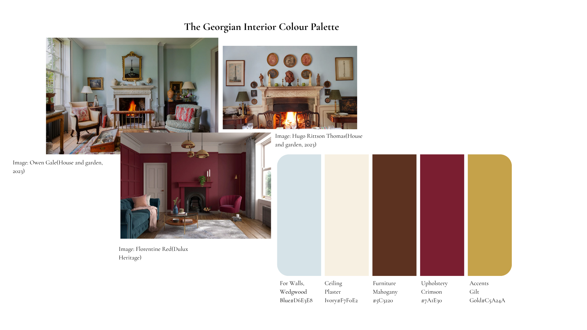
What makes the Georgian palette so instructive is its structure. Pale, cool walls served as a quiet backdrop — not neutral in the modern sense, but deliberately recessive. Against them, dark mahogany furniture and richly upholstered seating advanced with real presence. Gilt mouldings on the cornices and doorframes caught candlelight and provided luminosity without adding another competing hue. The palette was built on contrast: cool and warm, pale and deep, matte and reflective. Every element had a role
Georgian designers understood something that we sometimes forget: colour is not a decoration applied to a room. It is a structural element of the room itself.
Colour in this period also carried meaning beyond aesthetics. The ability to use expensive pigments — particularly the blues and verdigris greens — was a signal of status and education. Crimson silk upholstery was not simply beautiful; it was costly, and visibly so. The Georgian client was not shy about this. The room was meant to perform, and colour was one of its primary instruments of expression.
The contemporary palette: colour in service of feeling
If Georgian colour performed, contemporary colour is more likely to retreat. The prevailing sensibility in residential design today leans toward warmth, restraint, and a quality of atmosphere that feels less curated and more inhabited. We are drawn to colours that do not announce themselves — that simply make a room feel good without demanding that anyone notice them.
This is not timidity. It is a different kind of intelligence. Where Georgian interiors used colour to tell a story about the person who owned the house, contemporary interiors are more interested in how the house makes that person feel. The shift is from display to experience — and it is a significant one.
THE CONSIDERED MODERN ROOM · A CONTEMPORARY PALETTE
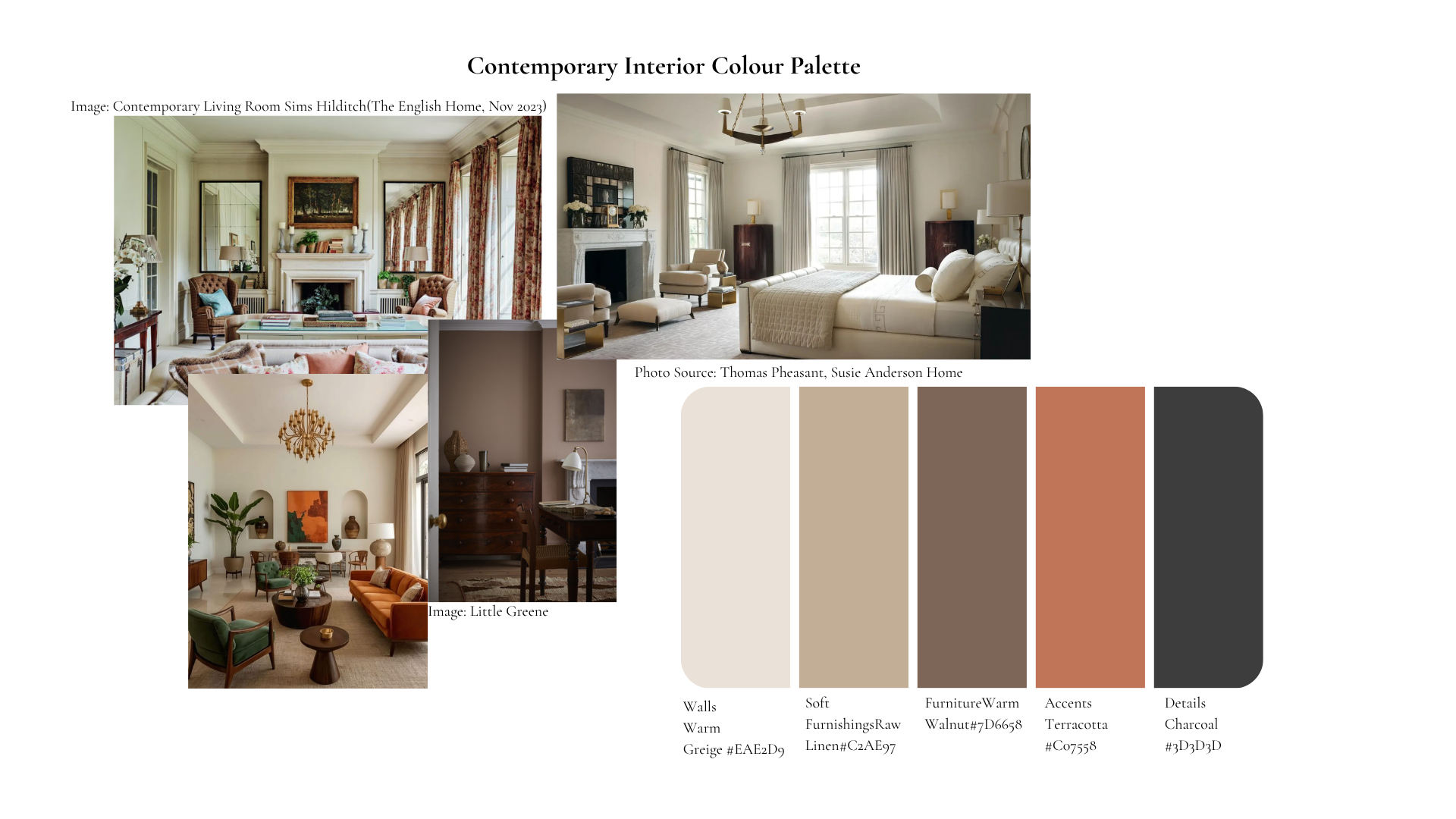
The contemporary palette shown here is built on tonal harmony rather than contrast. Warm greige walls, raw linen upholstery, and walnut furniture exist in the same tonal family — slightly different in value and warmth, but clearly related. There is no jarring jump between the wall and the sofa, no moment where the eye is brought up short. Terracotta introduces a note of quiet vitality: enough colour to prevent flatness, not so much that it becomes a statement. Charcoal in the frames and ironwork grounds the composition without introducing a new hue.
The effect is cohesion. The room does not read as a collection of decisions made independently; it reads as a considered whole. This is the goal of the contemporary palette — not to impress, but to settle.
What connects them: the enduring principles
Different in tone, different in intention — and yet the Georgian and contemporary palettes share more than might be obvious at first. Both use a pale, recessive background to allow furniture and furnishings to take presence. Both use depth and weight in the darker tones to anchor the composition. Both limit the number of colours and allow texture and material to do the work that additional hues might otherwise be called upon to do.
The most enduring lesson from Georgian interiors is not any particular colour. It is the understanding that colour works relationally — that the quality of a blue wall depends entirely on what sits against it, what light falls across it, and what the eye travels to next. This relational quality of colour is as true in a warm greige room today as it was in a candlelit drawing room in 1780.
When I work with clients on colour, this is the conversation I want to have — not simply what colour they like, but how they want the room to feel, what the light does at different times of day, and what story the space needs to tell. Colour is one of the most powerful tools available to a designer, and the most considered rooms — Georgian or otherwise — are the ones where every choice was made with that understanding at the centre.
References/Bibliography
Dulux Heritage (n.d.) Image: Living Room Available at: https://www.duluxheritage.co.uk/en/colours/1780077/florentine-red (Accessed: 31 March 2026)
BBC (September, 2017) Available at: https://www.bbc.co.uk/homes/design/period_georgian.shtml(Accessed: 31 March 2026)
Etons of bath(June 7) Captivating Georgian colour schemes Available at: https://www.etonsofbath.com/inspiration-from-history/captivating-georgian-colour-schemes/ (Accessed: 31 March 2026)
Image: Living Room Owen Gale Available at: https://www.houseandgarden.co.uk/gallery/how-to-decorate-a-georgian-house (Accessed: 31 March 2026)
Image: Georgian cottage living room, design by Etons of Bath. Available at: https://www.etonsofbath.com/inspiration-from-history/captivating-georgian-colour-schemes/ (Accessed: 31 March 2026)
Image: Contemporary Living Room Sims Hilditch Available at: https://www.theenglishhome.co.uk/interiors/design-ideas/how-to-decorate-a-georgian-home/ (Accessed: 31 March 2026)
Image: Mochi, Little Greene Available at: https://www.littlegreene.com/mochi (Accessed: 31 March 2026)
Image: Living room, Thomas Pheasant. Available at: https://www.suzieandersonhome.com/a/blog/how-to-decorate-classic-contemporary-style-interiors-our-top-10-styling-tips?srsltid=AfmBOooY24RGb0JzGPgmaHmE4o2qOTilFAwoXLJff8UeMu3WsGHA88UY (Accessed: 31 March 2026)